After Deployment
Objective: After Deployment is a military health website that needed a more modern look and feel and the content restructured to be more easily navigated and digested. T2 was looking to improve user base by creating an RWD (Responsive Web Design) site that would attract mobile and tablet users. This was to be the flagship product and all other sites and mobile apps would follow a similar approach.
Solution: Collaboration and communication helped this design come to its final look and feel. Product owners were pleased and were looking forward to working with developers to bring the concept. They found the concept easy to navigate and feel more like an inviting website that was easier to see on mobile devices. I also worked on prototyping web and mobile apps to give developers a visual reference.
Client: After Deployment
After Deployment is a military health website that assist military personnel find resources and information on things they are struggling with. Creating a mobile design helps with being able to connect soldiers and their families with information and research resources.
My Role and tasks: Lead UX Designer and Art Direction
-
User journeys, stories und flows
-
Personas
-
Presentations
-
Wireframes
-
Defining Design Principles
-
Design and Style Guide
-
Branding
-
Evaluation of user feedback
-
Usability testing

Research

Research:
I researched similar military websites looking at layout and patterns. I looked for consistency in the design. Researching what color palettes military personnel adapt too. How the information was distributed and what were the "Calls to Action". I worked directly with product owners and subject matters experts, giving them some ideas on different designs and proof of concepts based on research. Designing concepts for both Desktop and Mobile applications.

User Flow and Lo-Fi Concept and Wireframes
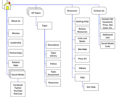
User Flow Sitemap:
Creating a sitemap is useful to see the navigation of the site and establishing the pages and information of the site. This is a basic road-map that can be altered or added to taken away from.

Lo-Fi Concept:
I start every process with notes and quick sketches to evaluate options. Drawing small ideas is helpful when laying things out. I find this helpful when meeting with product owners about concepts and playing around with color palettes.

HiFi Concept :
Created a series of Hi-Fidelity concepts to promote color palettes as well as establishing the look and feel for the UI button treatment.


HiFi Concept : Assessments
There would be an assessment page that could be accessed through different topics. Clicking on the button for assessment would run the user through a series of questions in order to gage there current aliment.
HiFi Concept : Videos
Watching videos could help the user in gathering more information about the topics the are interested in, These videos could be accessed using a database that is created and approved by the subject matter experts and phycologist specializing in the certain topic.


